Icon: Rectangles
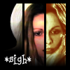
Go from this
 to this
This was done using Gimp 2.6. This assumes you've looked at General Icon Techniques.
- Take the image and clean it up as per your liking. Call it layer Orig.
- Make three versions of the image with different looks.
- Duplicate Orig; call it L1.
- Color -> Levels -> Auto; this can heighten the contrast, make the image brighter.
Result (L1):
- Duplicate L1 twice. Call them L2 and L3.
- Hide L1 and L3.
- Duplicate L2; call it L2-col; apply Color -> Auto -> Color Enhance to it.
- Change the mode of L2-col to overlay (or color, or hue) and adjust the transparency of it to your liking; the idea is to get a version of the image which is more colourful than the L1 image, but not too garish. When you're satisfied, right-click on L2-col and Merge Down.
Result (L2):
- Hide L2, show L3.
- Now we want to apply a gradient map to L3. Pick a gradient which starts dark, goes to light in the middle, and then goes dark again. Do Color -> Map -> Gradient Map; if you don't like the result, undo and pick a different gradient (or make a new gradient yourself).
Result (L3):
- Make three rectangles:
- Image -> Guides -> Add Guide by percent; add one vertical guide at 33% and another at 66%.
- Make a new white level called Rectangles; this is a helper level, it will be hidden in the final image.
- Use a rectangle select to select the first third of the area. If you have View -> Snap to guides set to true, then the selection should snap to the first guide.
- Shrink the selection by 1-3 pixels, depending on how chunky you want the end result to be. We will be adjusting things later anyway.
- Bucket fill in Rectangles layer with black.
- Do the same for the middle third and the last third of the image area.
- Now we need to adjust the rectangles, because right now, the lines separating the rectangles from each other are wider than the lines around the edges of the image. Pick the pencil tool, and pick the 1-pixel brush. Paint straight lines in black to widen the rectangles, and/or paint straight lines in white to widen the borders. The trick of straight lines is to click one pixel, then move the mouse while holding down Shift and then Ctrl. It also helps to zoom the image to 400% or 800%.
Result (Rectangles):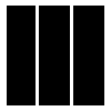
- Make the frame:
- Make a new transparent layer called Frame.
- Do fuzzy select on the white part of the Rectangles layer.
- Make the Frame layer active, and bucket fill with black.
Result (Frame):
- Show the three thirds separately:
- Show L2 and hide other layers above it, except Frame.
- Add Layer Mask to L2; make it white (opaque).
- Make Rectangles active, and use Fuzzy Select to select one of the rectangles. Invert the selection.
- Make the layer mask of L2 active; bucket fill with black. This should hide everything in L2 except for the chosen rectangle.
- Repeat this on L3, chosing a different rectangle.
- You may need to undo and redo this a few times as you figure out which combination of thirds looks best.
Result (three thirds with Frame):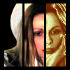
- Fade out on the frame:
- Make Frame active.
- Use either the pencil tool, or rectangular select + bucket fill, to fill in parts at the bottom of the rectangles with black. The right-most rectangle should have the biggest area which is not filled, the middle rectangle is smaller, and the left-most rectangle should be the smallest, in an aesthetically pleasing series of steps.
Result (fade-out frame step 1):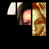
- Add a layer mask to the Frame layer.
- Rectangle select the part of the right-most frame that you just filled in; that is, from the bottom of the current rectangle to where the bottom border used to be, a selection the width of that rectangle.
- Make the layer mask active. Pick the gradient tool, and a black-to-white gradient. Do a linear gradient in the selected rectangle, such that the top of the selected area is black, and the bottom is white. This gives a gradual fade.
- Do the same for the middle rectangle, but instead of the selection bottom being where-the-border-used-to-be, make it stop a little further up.
- Do the same for the left-most rectangle, and make the area selected end a little further up again.
Result (fade-out frame step 2):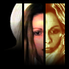
- Add your text.
Result (with text):
- Done! Save the image as an .xcf file if you want to refer to it later. Flatten the image and save as a .png or .jpg file.